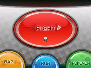
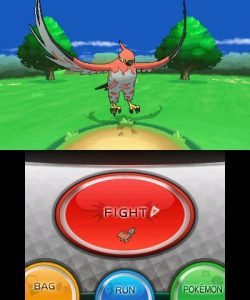
Fans had yet to see a glimpse of the battle interface for 6th generation of Pokémon games, but Nintendo recently posted new screenshots to its 3DS eShop. These confirm that an options menu resembling post-Gen IV games will be continued in X & Y, but with a much smoother graphical flair which focuses on circles and ovals instead of rounded boxes.
A notable omission is the helpful clock that appeared in Pokémon Black 2 and White 2. Luckily the 3DS Home button will bring up system information, including the time, if a player doesn’t have an external clock handy.
Excited? Disappointed? We want to hear!
<3 pokejungle
Featured Thread: What’s your favorite mini-game/sub-game? by Pikachu Representative

