This installment of Art Appreciation is on the first four new Gen Six Pokémon we saw – Gogoat, Fletchling, Pancham and Helioptile. I chose these pieces of artwork as I thought they showed each of their personalities well (or what I think they will be like anyway!).
Remember to add your very own art (and check out other peoples) in Smeargle’s Canvas and the Mount Moon Thread.
[spoiler]
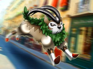
Gogoat is seen here charging through the city; perhaps he is on his way to pick up a trainer for a tour of this new region? This style of Gogoat is very similar to Ken Sugimori’s original artwork, simple lines, colours and shading. However, this artist has used a bold highlighting to emphasise his strength and muscle as he flies across the image. I also noticed that the foliage around his neck and back has a leafy texture (which appears to be a digitally drawn pattern) and adds some interesting depth and variation of colour onto Gogoat’s beige toned body. I’m not sure if the background is an edited photograph or drawn but the motion blur effect really shows the speed of Gogoat, and how he might be used in the game!
By cscdgnpry
Here we have little Fletchling perching in a tree, singing away. This is a very soft, calm picture, with light pastel shades of pink, blue and purple. This is all brought together by the brown of the branch, the black of his tail, beak and eye, and the boldness of his red face. The simplicity of the background helps this little bird stand out, as although they are similar colours to eachother, the shading lifts him into the foreground. I love his fluffy tummy and how small he looks, plus the little glint in his eye makes him appear young and full of life, just like a fledgling bird!
By joltik92
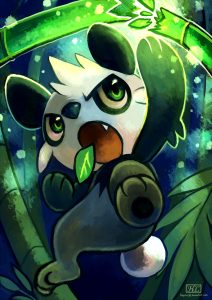
Pancham is looking super energetic in this drawing, karate chopping his way through the bamboo! Although the background is dark and gloomy throughout, Pancham’s energy is lighting up the place as he cuts his way cane after cane through the dense forest. His signature leaf in his mouth somehow manages not to fall out while he’s hard at work smashing the place apart. I like how the lime highlights define his movement through the image. I also love how the bright green punches through the dark blues, and his eyes light up out of his monochrome body – they really are the focal point of the image for me.
Helioptile reminds me of Scraggy, trying to act all brave when really, he’s just a bit silly (in the anime anyway)! Here he is seen flexing those little muscles of his, whilst charging up his electricity, shown by the blue glow and little sparks coming off his frills. Again, this style reminds me slightly of Sugimori’s style, but with softer shading and the obvious glow. The determination on his face comes across well with his piercing blue eyes peering out of the shadow of his brow making him seemingly ready to attack! It will be interesting to see what/if he evolves into something else and what that might look like too!
[/spoiler]
What do you think each of these Pokémons personalities will be like? Do you think these pictures captured them well or do you see them differently? Comment and let us know!
Next time I will do the next bunch of some other new Gen Six Pokémon! See you then 🙂
