Today we will be looking at some wonderful artwork Pokémon fans have made for the three new starters for Gen Six! I am going to try and choose two images for each Pokémon, one more realistic and the other more cartoon looking, so we can compare them to each other.
Remember to add your very own art (and check out other peoples) in Smeargle’s Canvas and the Mount Moon Thread.
Chespin
[spoiler]
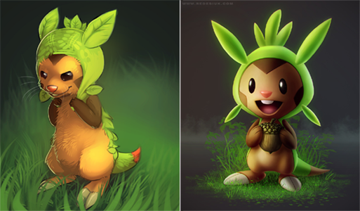
Chespin is the Shelled Chestnut Pokémon, and will probably be my starter!
I will start with the more realistic image on the left. I enjoy looking at these more lifelike Pokémon images, it brings the dreams of them really existing just that little bit closer. Chespin has a cheeky and mischievous look on his face whilst grasping his leafy hat to his head. The dark background with the lighter grass in front makes it feel as if he is sneaking around at night in the undergrowth getting into trouble. The detail of his fur and the glint in his eyes really bring him to life and you can almost imagine him scuttling around a forest getting up to all sorts.
The second picture is a much more stylised drawing, almost 3D looking. Similarly to the previous picture it is in a dark setting, but instead of looking quite so mischievous, he’s looking rather pleased with himself for finding a tasty acorn! The simplicity of the picture works well in making him look sweet and innocent, as the lighting glows softly which also helps him stand out from the dim backdrop. This cartoon style is closer to the actual Pokémon artwork by Ken Sugimori, but a smoother and sleeker three-dimensional version.
Overall these two images are very different artistically but both show a slightly cheeky side to Chespin and it’ll be interesting to see what his personality is like in the game and anime!
(First image by Possim)
(Second image by Tanathe)
[/spoiler]
Fennekin
[spoiler]
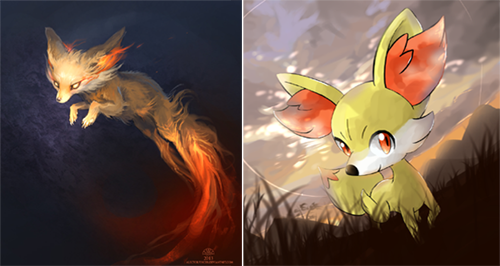
Fennekin is the new fire starter who is rather foxy! On the left we have the more realistic, if not slightly scary drawing. She is leaping through the air, as if in mid-pounce and about to get her prey. Her fiery accents are bright and glowing against the dark background and muted cream coloured fur. I love the detail in this piece of art, all the way down to her claws and flowing hair. Her glowing eyes give her a slightly demonic look and her slight frame makes her look delicate but great for sneaking about. I can just imagine Fennekin prowling through a field at night, hunting by the light of her flaming ears.
Secondly we have our much sweeter looking drawing! The splodgy watercolour effect gives it a soft look and makes it seem as though dusk is approaching with the light slowly fading away. The background is wonderfully drawn, with the hills and clouds behind her and the tufts of grass poking out in the foreground. Although the backdrop has been made with a limited brown, orange and blue palette it does help Fennekin’s bright yellow and red body stand out. Her shining red eyes pop out from her light coloured coat and the smirk on her face also gives her a slightly naughty expression.
Even though these two pieces of art are very different in style, they both show her foxy personality off and place her in her natural habitat of prowling about in the dark. Can’t wait to see if she’s sweet or sour when we get to know more about her!
(First image by Alectorfencer)
(Second image by Nintendo-jr)
[/spoiler]
Froakie
[spoiler]
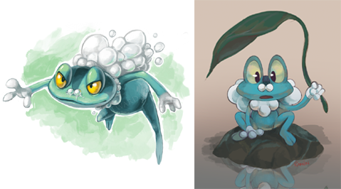
Finally, here is Froakie, our little frog water Pokémon! Again we will start with the more realistic version. He looks as though he needs a tissue as he has two little bubbles coming out of his nose and then a whole load more on his back, which looks more like a cape to me than anything else. His body looks similar to a real frogs anatomy compared to other Pokémon based on frogs/toads. His face has angry expression as he looks to be leaping into action! The watercolour look goes well with Froakie, seeing as he is a water Pokémon, and the greens match the colour of the surroundings you may find him in, ponds and undergrowth.
Froakie picture number two looks a lot more like the original that we know and love. I think it looks a bit like he has a bubble moustache, beard and long hair, and has a “wise old man” look about him. However, in this picture he is looking a little confused watching his reflection. Again they have used the natural palette to create his surroundings and this time it is slightly more dull and muddy looking, but his blue skin still stands out from the browns and greys. Finally, for reasons I cannot fathom, he is holding a leaf over his head. I just don’t know.
Even though one of these is much more anatomically correct, both of them are very similar in colour and are both in a painted style. It will be interesting to see if his bubbles turn into hair or a cape as he evolves!
(First image by Twarda8)
(Second image by Boywithmeese)
[/spoiler]
I can’t wait to hear your views on these images! Do you prefer the more cartoony or more realistic versions? Would you like a realistic Pokémon game?
I will start to do all the new Gen Six Pokémon that we have seen so far and go from there!
